Design & Vision Deck
Kindant
AI-powered consumer health insurance navigation.
One agent. One relationship. No forms. No jargon. No handoffs.
p0stman for ThynkNu / April 2026 (pre-build vision deck)
01
Meeting Agenda
02
The Vision
“One agent that knows you, understands your cover, and guides you from research to claim. No forms. No call centres. No jargon.”
The problem today
Buying and using health insurance is a fractured experience: brokers for advice, forms for underwriting, PDFs you never read, call centres for claims, separate apps for clinical services. Each stage is a disconnected interaction with a different party.
What we replace it with
One ambient, contextual agent that knows who you are, what you've asked before, what your policy covers, and what you're going through now. Insurer-agnostic. Independent. Always on your side.
Four journeys, one relationship
Pre-purchase research and invisible underwriting
Onboarding, policy Q&A, ongoing management
Care navigation, find providers, book appointments
Claims assistance and dispute support
03
Market Landscape
Where the health insurance tech market is today, and where this product fits in.
The global insurtech market reached approximately $5.5B in 2024 and is projected to exceed $150B by 2030. Most innovation remains insurer-owned, tied to a single carrier's products and focused on operational efficiency rather than consumer empowerment. No dominant player has emerged offering an insurer-agnostic, full-lifecycle AI agent for consumers.
Key players today
Own tech stack with AI claims and member navigation. Single-carrier only.
Health insurance super app with AI triage and claims automation. Valued at ~$4.5B. Single-carrier.
AI-first claims via 'AI Jim' chatbot. Sub-3-second payouts for simple claims. Limited health expansion.
Behavioural health rewards platform. AI used for wellness nudges, not navigation or transparency.
Largest pan-Asian insurer. AI for agent tools and claims triage. Consumer AI remains basic FAQ chatbots.
Digital tools for members (symptom checker, provider search). No AI underwriting transparency.
HK's first virtual insurer. Digital-first purchase flow but limited post-purchase AI. Backed by Sun Life.
Asia's largest insurtech. AI-driven micro-insurance. B2B platform focus, not consumer navigation.
What exists
Insurer-owned chatbots that handle FAQ, basic claims submission, and symptom triage, all locked to a single carrier's product set. AI is deployed for back-office efficiency (fraud detection, claims automation, underwriting risk scoring) rather than consumer transparency.
What's missing
No product lets a consumer bring any policy (or no policy) and get AI-guided help across the full lifecycle: researching options, understanding underwriting decisions, managing coverage, navigating care, and resolving claims. The “insurer-agnostic trusted advisor” role is filled only by human brokers, who are expensive, inconsistent, and unavailable at scale.
Hong Kong context
Hong Kong's health insurance market is broker-dominated with over 160 licensed insurers, creating acute consumer confusion. The 2025 VHIS reforms increased standardisation but not transparency. AIA, Bupa, and Bowtie are digitising purchase flows, but post-purchase support remains manual. Southeast Asia and Greater Bay Area cross-border health coverage is a growing pain point with no digital solution.
Key trends shaping the opportunity
Conversational AI
Shift from form-based to dialogue-based insurance interactions: voice, text, and document upload.
Underwriting transparency
Consumers increasingly expect to understand why they were rated, excluded, or declined.
Embedded insurance
Health coverage bundled into employer platforms, neobanks, and wellness apps.
Parametric health
Automatic payouts triggered by diagnosis codes or hospitalisation events, no claims process.
Multimodal document intelligence
AI that reads policy documents, medical reports, and bills to extract actionable information.
Regulatory tailwinds
HK Insurance Authority pushing digital-first licensing. Singapore and Australia tightening consumer protection.
04
Naming & Straplines
Decided 23 April 2026: Product = Kindant, Agent = Vera (two-brand model). Pending trademark clearance.
Four directions were presented. Sarah chose a two-brand model: Kindant for the platform, Vera for the AI agent.
Vera
Latin for 'truth'
“Your health, clearly understood.”
“Insurance without the fine print.”
“One conversation. Complete clarity.”
Works as both product and agent name. Human, warm, bilingual-safe. Strong trust signal through etymology.
Kairo
From Greek kairos, 'the right moment'
“The right cover, right when you need it.”
“Health insurance, timed to your life.”
“Always the right moment to be covered.”
Premium, distinctive, strong TM availability. Close to 'care' phonetically. No existing brand conflicts.
Aegis
The shield of Zeus in Greek mythology
“Protection that understands you.”
“Your shield in the health system.”
“Guided. Guarded. Covered.”
Authoritative, timeless, strong protection metaphor. Works well for the HK/Asia premium market positioning.
Haven
A place of safety and shelter
“Health cover that feels like home.”
“Your safe place in insurance.”
“Navigate health with confidence.”
Consumer-warm, instantly understood, universal. Strong emotional resonance for health/protection.
05
Design Direction
Three moodboard directions. Each has a distinct colour palette, font pairing, and personality. We pick one direction (or blend elements) and build from there.
Clinical Trust
Clean, medical-grade, confidence-inspiring
UI Concept
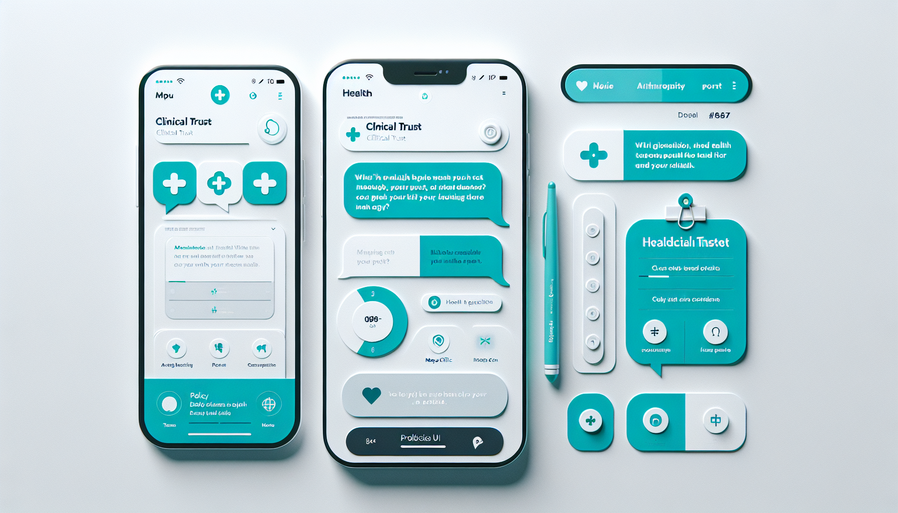
Mood & Tone

Mood Film
AI-generated concepts to illustrate colour and mood direction, not a representation of the final product.
Sample Chat Feel
Colour Palette
Primary
#0F766E
Dark accent
#134E4A
Background
#F0FDFA
Text
#0F172A
Muted
#64748B
Surface
#FFFFFF
Typography
Sans-serif headings with serif body for authority
Medical-grade precision meets consumer warmth. Think Mayo Clinic meets Stripe. Confidence through clarity, not decoration. White space communicates competence.
Best for: If the product leans into clinical credibility and the HK premium health market.
Warm Guide
Human, approachable, modern wellness
UI Concept
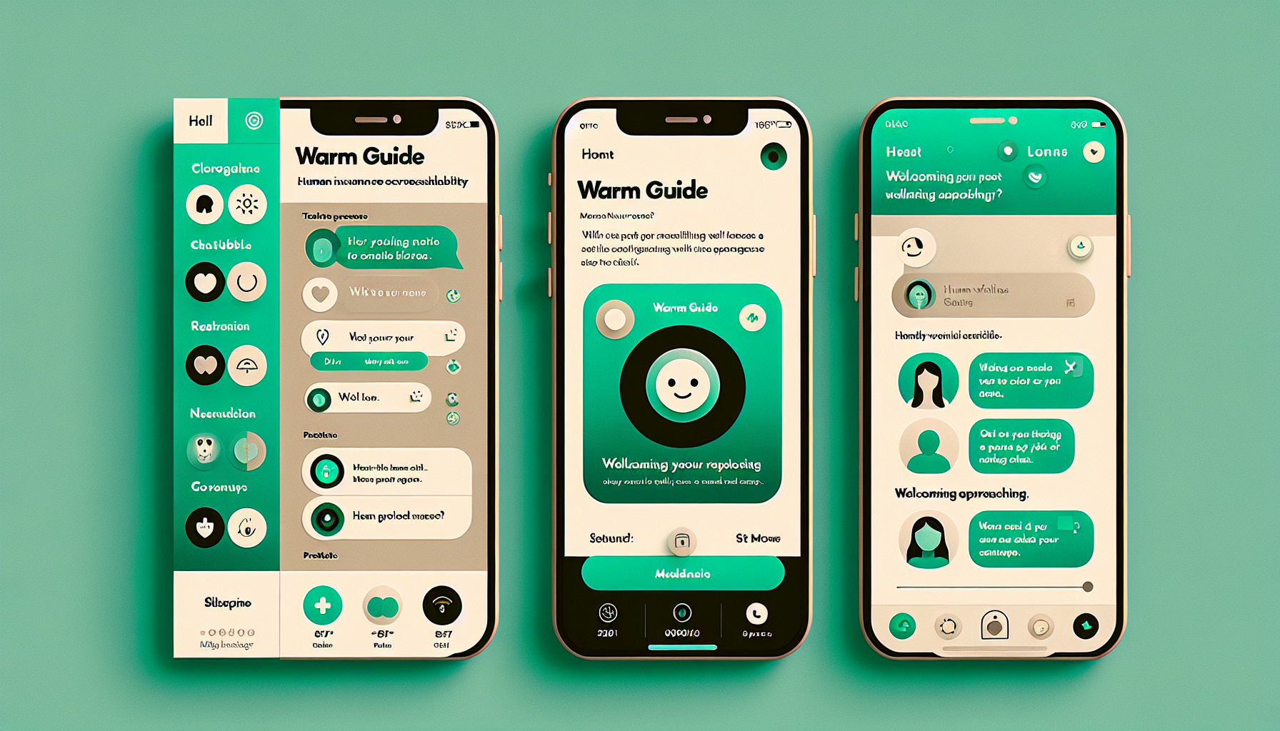
Mood & Tone

Mood Film
AI-generated concepts to illustrate colour and mood direction, not a representation of the final product.
Sample Chat Feel
Colour Palette
Primary
#059669
Dark accent
#065F46
Background
#ECFDF5
Text
#1C1917
Muted
#78716C
Surface
#FAFAF9
Typography
Unified sans-serif with weight contrast for warmth
A friend who happens to understand insurance. Rounded corners, generous spacing, conversational tone. Think Headspace meets Monzo. Accessible without being childish.
Best for: If the product leads with the conversational agent experience and wants mass-market appeal.
Premium Minimal
Luxury, sophisticated, Asia-market-ready
UI Concept

Mood & Tone

Mood Film
AI-generated concepts to illustrate colour and mood direction, not a representation of the final product.
Sample Chat Feel
Colour Palette
Primary/Gold
#B45309
Dark surface
#0C0A09
Text
#1C1917
Light bg
#FAFAF9
Muted
#A8A29E
Surface
#FFFFFF
Typography
Serif headings for luxury, sans-serif body for readability
High-end private health in HK is a premium product. This direction matches the market: restrained, elegant, confident. Think private banking app meets Bupa Premier.
Best for: If the target market is affluent HK consumers choosing premium health cover.
06
Agentic Design Patterns
How the best AI products in 2026 handle conversational agent interfaces. These are the patterns we will build on.
Progressive Disclosure
Never overwhelm. Show one step at a time, reveal complexity only when the user is ready. Expandable 'thinking' accordion panels let users see reasoning traces without cluttering the default view.
Underwriting feels like a conversation, not a 40-field form. Users can expand 'How I reached this decision' if they want the detail.
Action Cards
When the agent uses a tool or runs a process, show a discrete status card: 'Checking your policy terms...' with a spinner, resolving to 'Found 3 relevant clauses'. Users see what tools ran, not just the output. Table stakes for regulated domains.
'Evaluating medical history...' resolves to 'Standard terms apply. Here is why.'
Memory Pills
Surface what the agent remembers as inline chips: 'I know you have a family plan, is that still right?' Distinct from session history. Shows what the agent knows about you, not what you said.
Returning user sees editable context chips, not a blank chat. One tap to correct stale info.
Checkpoint-and-Confirm
For multi-step flows with consequences, the agent proposes a summary card at each decision point: 'Here is what I am about to do. Confirm?' Compresses conversational overhead versus question-by-question.
Before submitting an underwriting assessment: a summary card of all disclosures with a single confirm button.
Deterministic vs Generative Labelling
Visually distinguish rule-based outputs from AI-generated responses. A subtle badge or colour variant: 'Policy calculation' (deterministic) vs 'General guidance' (generative). Users must know when they are getting a rule versus an opinion.
Underwriting decisions carry a 'Rules engine' badge. Conversational advice carries a 'Guidance' badge.
Inline Source Anchoring
Every factual claim anchored to a named source, inline and tappable. 'Your policy (page 12) states a HK$5,000 excess for specialist referrals.' Not footnotes. Inline, tappable, opens the exact document section.
Tapping a citation opens the relevant page of the uploaded policy PDF, highlighted.
Graceful Human Escalation
A clearly labelled 'Speak to someone' affordance, always visible, never buried. Research shows this increases willingness to engage with AI by reducing perceived lock-in. A trust anchor even if rarely used.
'This needs specialist review. I have prepared a summary for the underwriting team.' One tap to escalate.
Proactive Intelligence
The best agents anticipate needs: policy renewal reminders, coverage gap alerts, preventive care suggestions. At the end of multi-step flows, generate a persistent audit summary with a case reference number.
'Your annual check-up is due next month. Want me to find providers near you?'
07
UX Principles
The six core principles that will guide every design and build decision.
Conversation is the interface
No dashboards, no nav menus, no settings pages (unless needed). The chat IS the product. Every feature is accessed through natural language. Forms are replaced by follow-up questions.
Mobile-first, always
80%+ of HK internet use is mobile. Design for a thumb, not a mouse. Bottom-anchored input, swipeable cards, voice as a first-class input. The agent should feel like messaging a friend on WhatsApp.
Trust through transparency
Health and money are high-stakes. Every recommendation must show its reasoning. Underwriting decisions cite the specific rules applied. No black-box 'the AI decided' moments.
One agent, continuous relationship
No handoffs between different 'bots' for different tasks. One agent that knows the user's full history, from first research to active claim. Memory and context persist across every session.
Progressive complexity
Start simple: 'What are you looking for?' End sophisticated: deterministic underwriting, plan comparison, claims filing. The interface grows with the user's needs, never front-loads complexity.
Fail gracefully, fail visibly
When the agent doesn't know, it says so clearly. When it needs human help, it explains why and what happens next. Never guess on health or financial decisions. Silence is worse than 'I'm not sure'.
08
Mobile-First Approach
80%+ of HK internet usage is mobile. The agent must feel native to a phone, not a desktop app squeezed onto a small screen.
Unified input bar with equal-status modalities
A single persistent input bar docked to the bottom thumb zone. Microphone, camera, and paperclip icons as equal-status affordances alongside text. Tapping any transitions the input in-place. No mode switching, no separate tabs.
Quick-reply chips
For guided flows (like underwriting intake), show 3-4 labelled chips above the keyboard for common responses. Eliminates typing for 80% of structured interactions. Context-aware and disappear on freeform input.
Voice transcript as editable draft
Never auto-submit voice input. Render the transcript as an editable draft in the input bar. The user reviews and submits. In health contexts, users need to feel in control of what they disclose.
Card-per-step layout
Each agent response is a discrete card, not a wall of text. Cards scroll vertically. Structured content (plan comparisons, coverage breakdowns) opens in a bottom sheet, preserving conversational flow.
Document upload with instant confirmation
When a user uploads a policy PDF or image, immediately surface a 1-2 sentence confirmation: 'I can see this is a Bupa International PPO, active until Dec 2026.' Closes the uncertainty loop before any question.
Swipeable plan comparison
Plan options and provider choices presented as horizontal swipeable cards. One-handed comparison. Each card highlights the key differentiator, with full details on tap.
09
Under the Hood
A simplified view of the technology powering the agent experience.
AI Layer
- Claude Sonnet 4.6 for reasoning
- Gemini 2.5 Flash for voice
- Gemini 3 Pro for document/image scans
- Haiku 4.5 for fast triage
Rules Engine
- Deterministic TypeScript
- No AI in underwriting decisions
- Full audit trail
- Validated against real UW trees
Platform
- Next.js on Vercel
- Supabase (auth, db, storage)
- Real-time streaming responses
- Mobile-responsive web app
Key decision: Underwriting decisions are never made by AI. A deterministic rules engine evaluates every disclosure against a decision tree built with Michael's production underwriting expertise. The AI asks the questions. The rules engine makes the decision. Full audit trail on every outcome.
10
Delivery Roadmap
A phased approach. Each phase delivers a usable product, not just progress towards one.
How to read this timeline
The week ranges below are a guide, not a fixed schedule. Each phase includes build time (where we are heads-down building) and buffer (time for you to test, give feedback, make decisions, and for us to meet). If feedback comes back quickly, we move straight on. If you need more time, the buffer absorbs it. The timeline is elastic and adapts to how fast we move together.
Foundation & Setup
Weeks 1-2
- Project setup: Slack, Vercel, Supabase, transactional email
- Technical kick-off session with Sarah and Michael
- Full PRD, build spec, data flow, site map, user journeys
- Name and logo finalised, design language system
- Agent persona, tone of voice, voice style guide
- Hosting region and domain registration
Core Product
Weeks 3-5
- Landing page with email signup
- Auth (Google SSO, email/password), onboarding, dashboard shell
- Journey 1: The Guided Choice (conversational UI, voice, PDF/image upload, ambient profile building, underwriting decision tree)
- Journey 2: The Living Protection (interactive policy explorer, coverage reassurance, health ecosystem connections)
- Stripe integration for freemium paywall
Complete the Journeys
Weeks 6-8
- Journey 3: The Trusted Guide (care navigation, provider search, pre-treatment coverage check)
- Journey 4: The Transparent Resolution (claims walkthrough, policy interpretation, advocacy prompts)
- Freemium gate live (Journeys 3-4 paywalled)
- User dashboard: policy storage, chat history, agent profile
- Analytics: usage, queries, coverage gaps
- Iteration on Phase 1 feedback
Polish & Handover
Weeks 9-10
- QA, bug fixes, performance tuning
- Mobile testing across devices and browsers
- Migrate from p0stman subdomain to ThynkNu's own domain
- Landing page updated for live launch
- Full codebase handover: repo access, credentials, documentation
- Handover session with Sarah and Michael
Approximately 10 weeks end-to-end as a guide. 3-5 weeks of that is active build; the rest is breathing room for testing, feedback, and decisions. Fast feedback compresses the timeline. Weekly Friday demos throughout.
11
Open Questions
Decisions we need to make together before the build begins.
Product name
Lock the name before domain, trademark, branding. Today's session should narrow to 1-2 finalists.
Target market
HK only? HK + broader Asia? Global ambitions? This affects language support, data residency, and regulatory positioning.
Design direction
Which moodboard resonates? Clinical Trust, Warm Guide, or Premium Minimal? Or a blend?
Agent name
Same as the product name (e.g. 'Vera' the product + 'Vera' the agent), or separate brand and character?
Journeys 3 and 4 specs
We need the domain documentation to design Trusted Guide (care nav) and Transparent Resolution (claims).
Payment rails
Stripe for freemium gating? Alternative for HK/Asia payment methods?
Data residency
Where should user data live? Supabase region choice (Singapore, Tokyo, or other) depends on this.
12
Next Steps
After this meeting, here is the immediate path forward.
Narrow name to 1-2 finalists. Run trademark + domain checks.
Lock design direction. Build initial colour system and component tokens.
Deploy skeleton app to staging.
Sarah/Michael: send Journeys 3-4 spec docs.
Begin Phase 1: core chat experience + Journey 1 (Guided Choice).